


2026 is set to be a year of comfort, character and quiet confidence in colour. After years of minimalism and muted tones, we’re now seeing a move toward warmth, richness and emotional connection in the colours people choose for their homes and personal style.
From deep nature-inspired tones to joyful pops of colour, here are the shades shaping the year ahead.
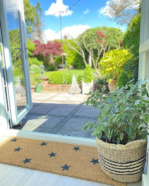
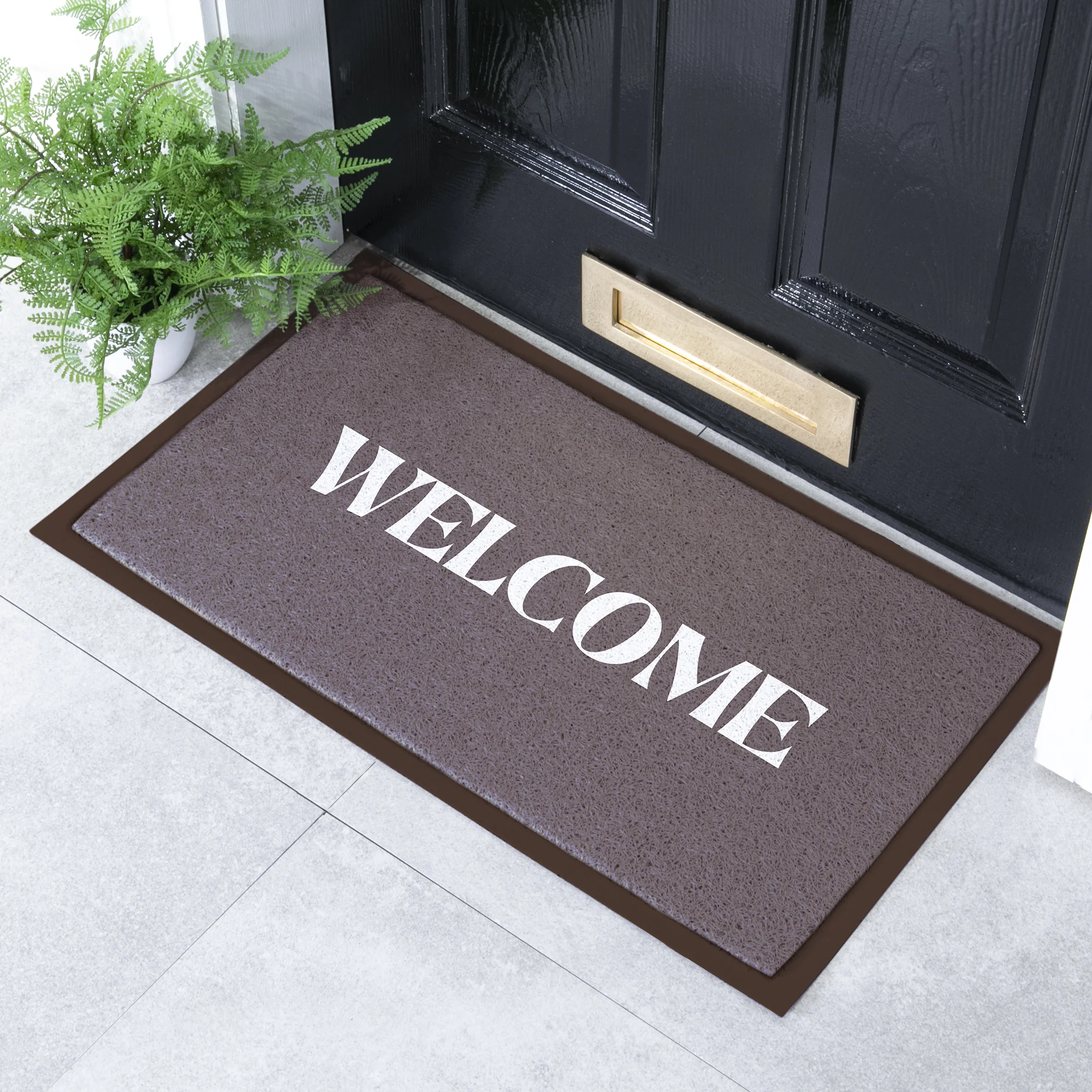
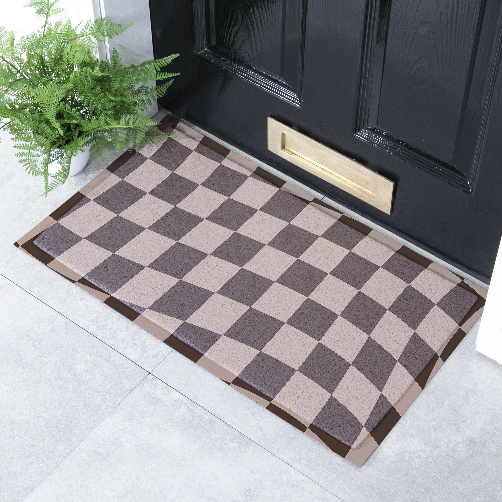
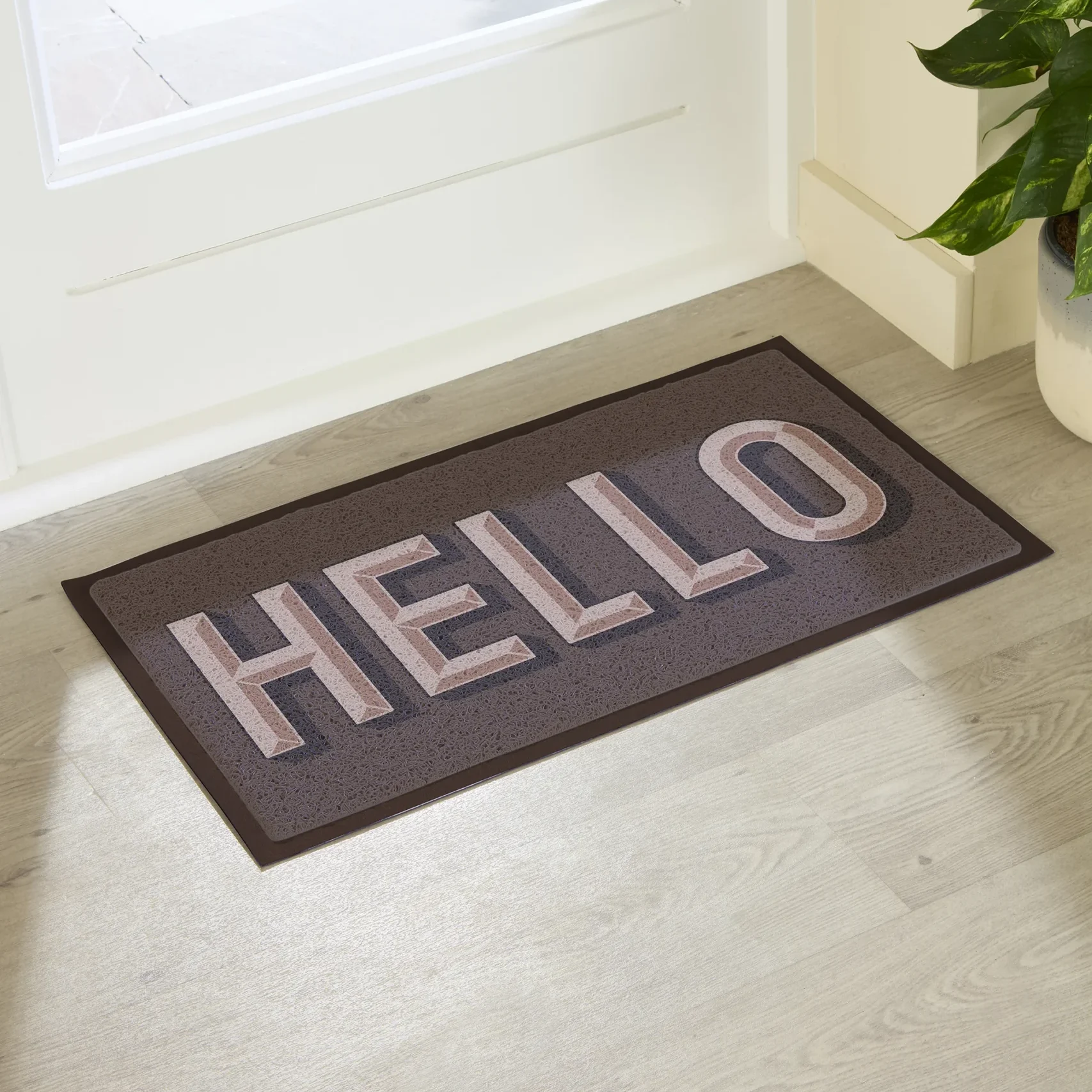
Chocolate Brown: The Colour of 2026
If there’s one shade truly defining 2026, it’s chocolate brown. Rich, comforting and effortlessly sophisticated, chocolate tones are taking over interiors, fashion and lifestyle design this year. 2026’s chocolate shades are deep, creamy and luxurious, offering warmth without heaviness.
Earthy, Grounding Luxury
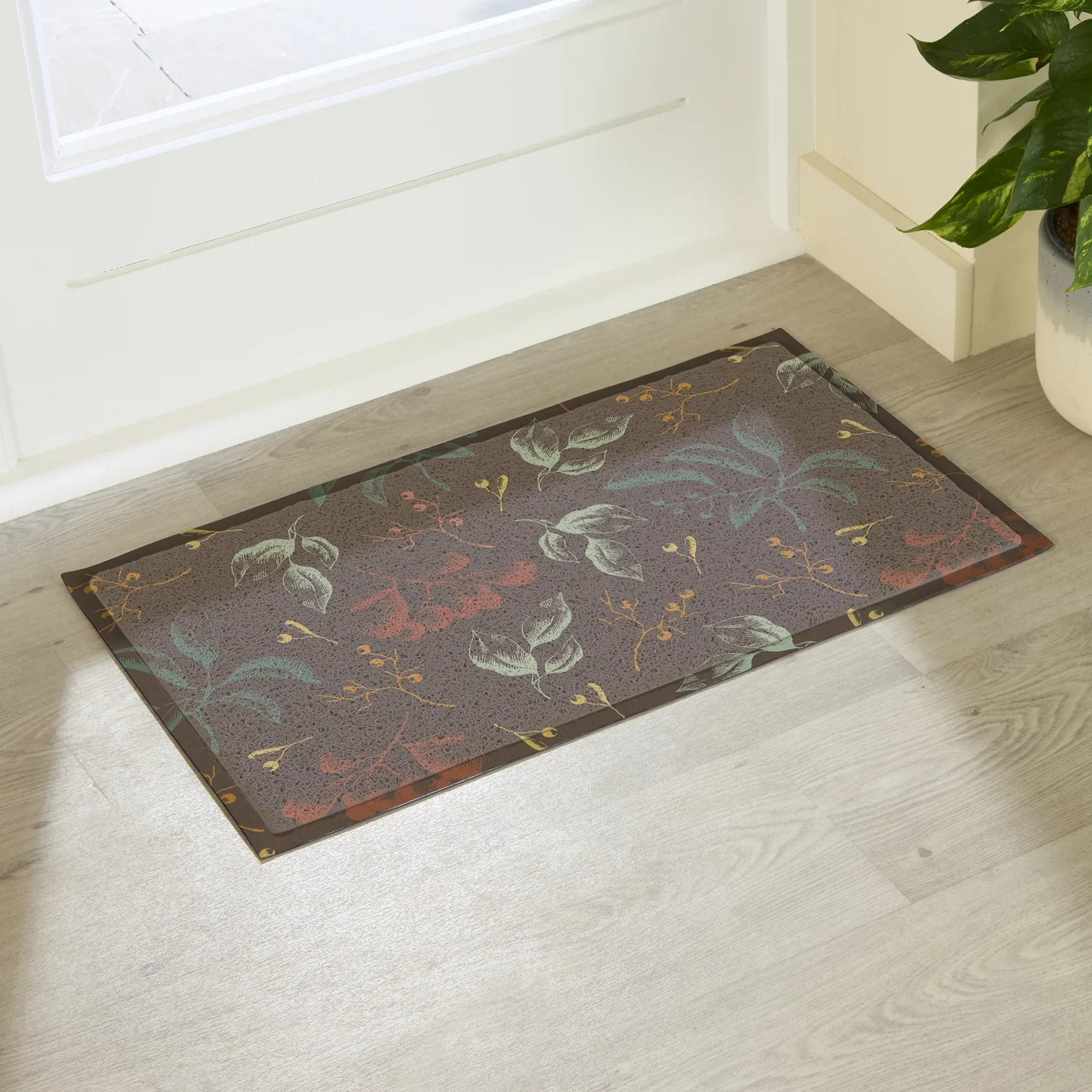
Nature continues to inspire colour direction, but 2026 takes the trend deeper, richer and more sophisticated. These tones feel grounding, nurturing and timeless rather than trend-led. Expect to see deep forest greens, olive and moss tones, burnt terracottas and warm umbers. These colours bring calm and depth into interiors, pairing beautifully with natural materials like wood, stone and linen. They create relaxing spaces that feel connected to the outdoors which is something homeowners are valuing more than ever.
Rich Blues and Inky Depths
Blue is evolving again in 2026. Forget soft pastels and airy coastal tones – the focus now is on deeper, moodier and more luxurious shades. These blues feel dramatic, elegant and quietly powerful. Navys, petrol blues and deep teals work brilliantly in living spaces, kitchens, bedrooms and statement décor. They add instant sophistication and pair beautifully with brass, dark woods and warm neutrals.
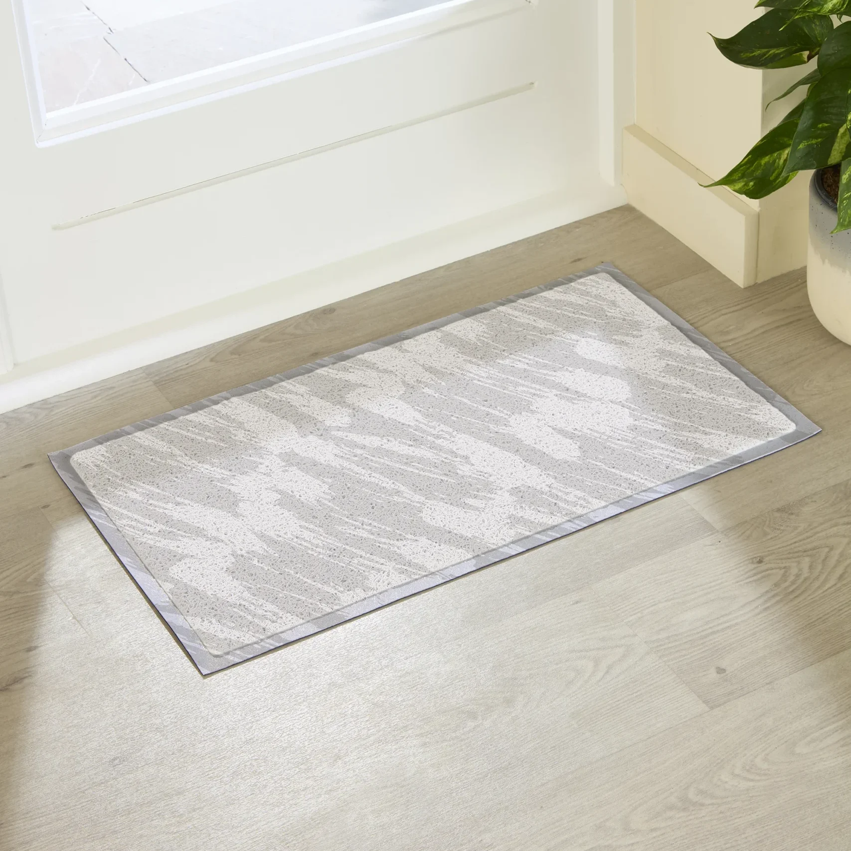
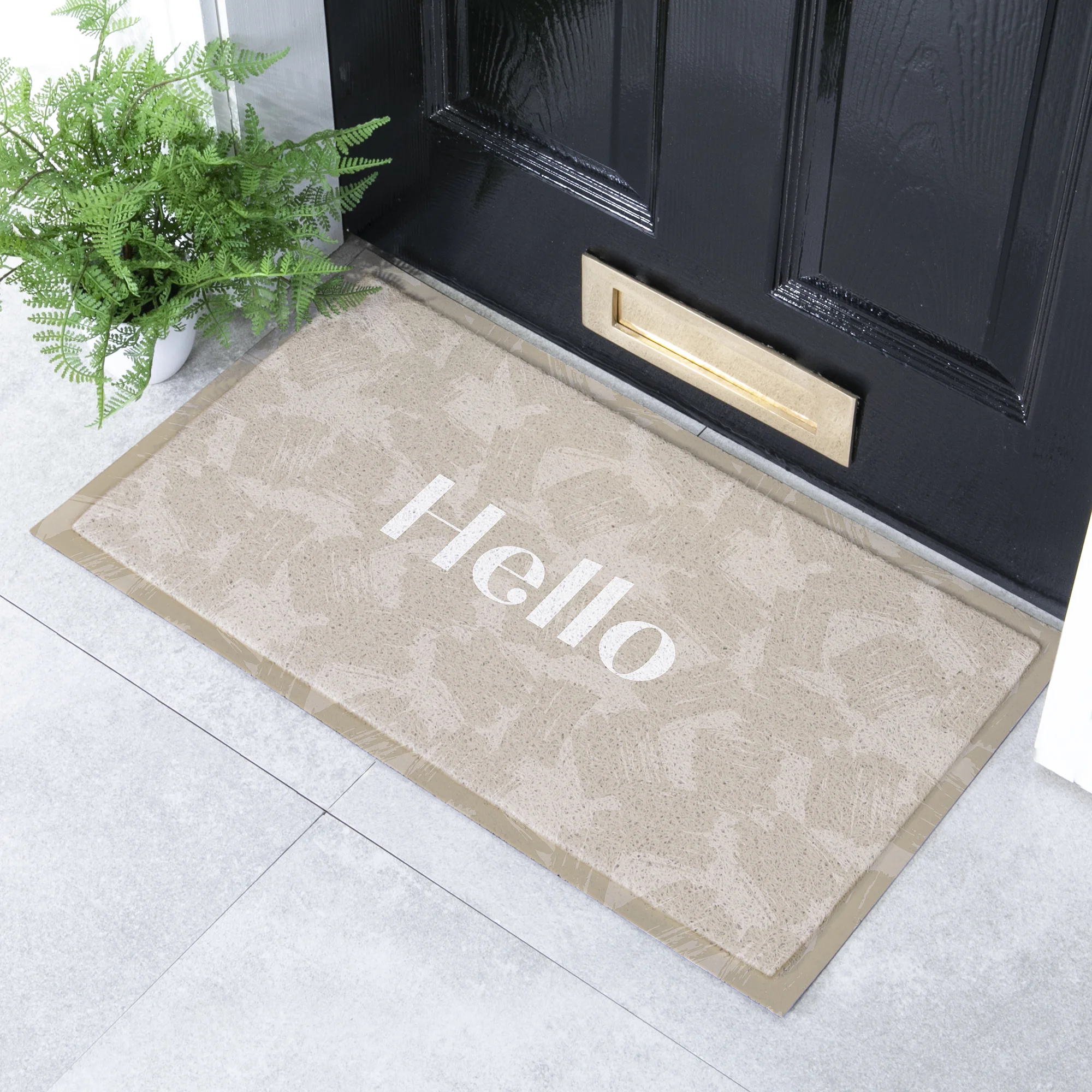
Warm Neutrals Take Over from Grey
Grey has had a long reign but 2026 is officially its gentle farewell. Instead, we’re seeing a rise in warming neutrals that feel softer, friendlier and more organic. Oat, mushroom and creamy off-whites bring serenity without feeling cold or clinical. They create a luxurious understated look and work perfectly as a base palette for layering bolder colours or textures.
Pops of Optimistic Colour
Alongside deep, grounding shades, 2026 also embraces joyful colour moments. After years of uncertainty globally, people are choosing colours that spark happiness and positivity. Look out for muted mustard, playful teal accents, peachy tones and soft corals. Used thoughtfully in accessories or feature details they add character and life without overwhelming a space.
Colour in 2026 is beautifully considered. It’s less about trends for trend’s sake and more about creating emotion, comfort and individuality. Whether you love deep moody shades, soothing neutrals or joyful pops of colour, this year’s palette offers something meaningful for every style of home.
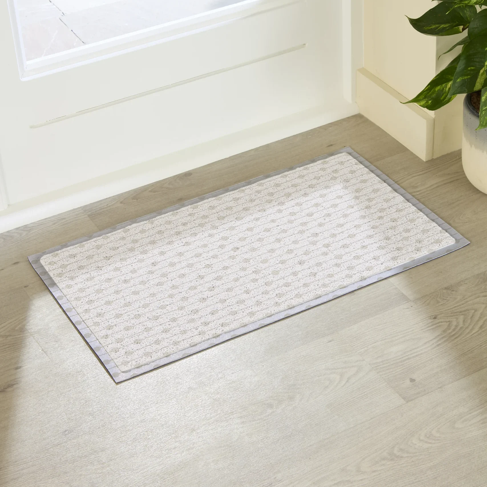
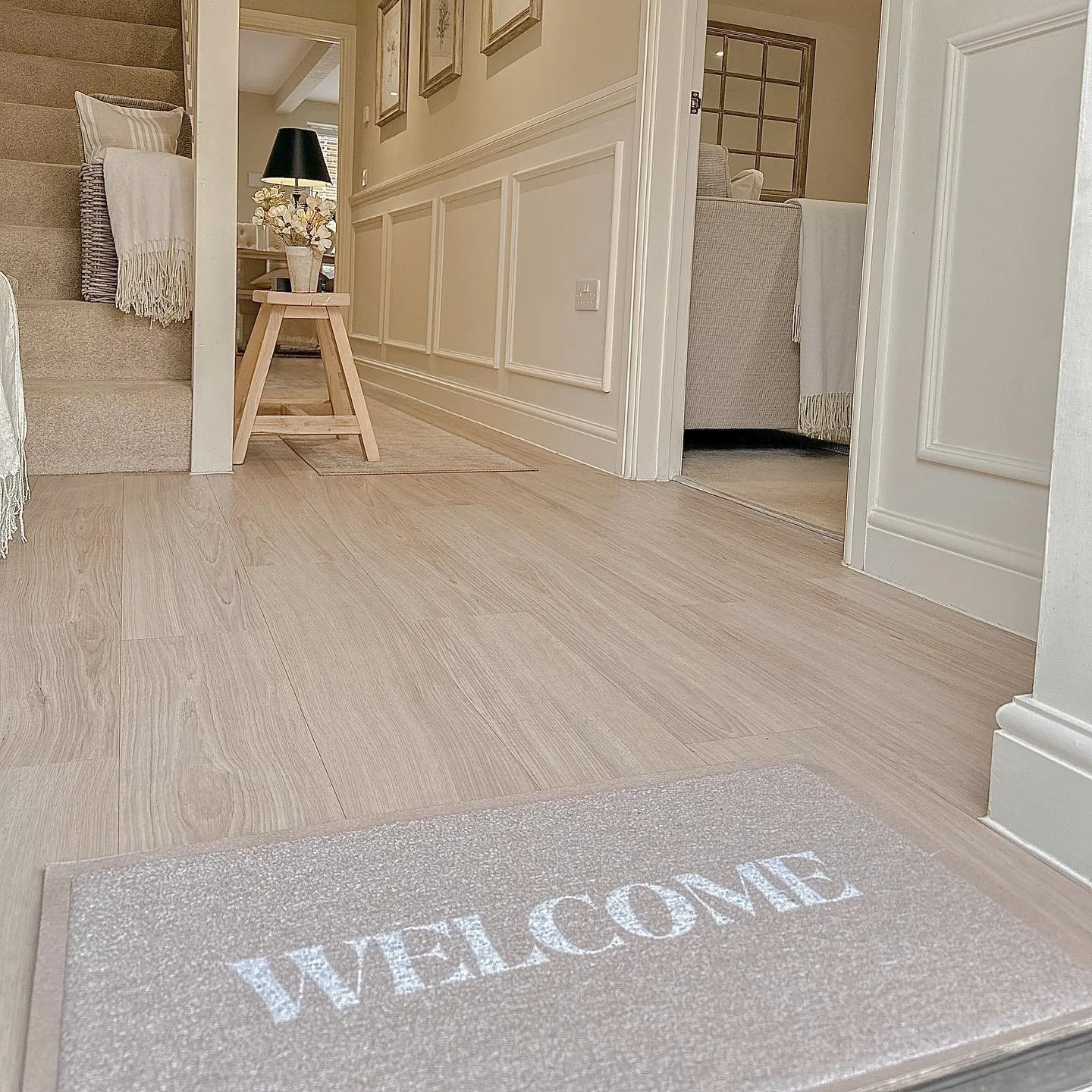
And we have a mat for every trend, and every home – shop our full range here.